


Start With B2B User Tasks and Research

B2B mobile app UX design should start with the work people need to finish, not with fashionable interface patterns. A polished dashboard can still slow a field technician.
Map the task from trigger to outcome: where it starts, what information is available, which decision is required, and how the user confirms completion.
Map the Work Before the Screens
Observe representative users handling real cases. Note interruptions, handoffs, device switching, repeated entry, and moments when people rely on memory or personal workarounds.
Combine interviews with support tickets and product analytics. Interviews explain motivation; tickets reveal recurring failure; analytics show where users abandon or repeat a step.
Use these actions to map the work before the screens:
- Write a job statement describing the user, situation, desired progress, and business outcome.
- Separate frequent workflows from rare exceptions, then protect a clear route for both.
- Record permissions, connectivity, and required customer data as workflow conditions.
- Rank friction by user impact, operational risk, and cost to correct.
Turn Research Into a Testable Flow
Sketch the current sequence before proposing a new interface. Mark the point where delay, duplicate entry, or uncertainty begins, and state what evidence would show improvement.
Use a clickable prototype to test the riskiest assumption before committing to a broad redesign or backend change. Ask users to complete a realistic task without coaching.
Connect UX Discovery to Delivery Planning
For product teams planning a larger initiative, compare the research sequence with this MVP planning guide.
Before estimating a redesign, turn validated needs into acceptance criteria and a release plan. Use both to define the custom app development scope.
Make Research Actionable
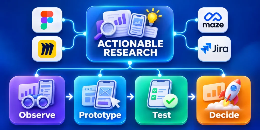
Convert observations into a testable hypothesis. Predict, for example, that saved customer context will reduce repeated lookup during a field visit.
Specify who benefits, which task changes, and what could get worse. A measurable hypothesis prevents a redesign from being judged only by preference.
Use these actions to make research actionable:
- Capture current completion time and common errors.
- Identify data users repeatedly search or re-enter.
- Prototype the smallest useful change.
- Define a stop condition before testing.
Connect Observations to Product Decisions
Translate each observed delay, error, workaround, or repeated question into a decision about information, interaction, policy, training, or technical capability.
Keep the original task and evidence attached so teams can distinguish a verified user need from an attractive but unsupported interface idea.
Prioritize the Smallest Useful Change
Choose improvements that address a specific failure without redesigning unrelated screens. State the intended effect, affected role, implementation owner, and measurement period.
Use prototypes when interaction uncertainty is high, and use configuration or content changes when the problem does not require new application behavior.
Preserve a Decision Record
Record what the team observed, which alternatives were considered, what was selected, and which evidence would justify revisiting the choice.
This history prevents later teams from reopening settled questions without understanding user context, operational limits, or the results of earlier tests.
| Research input | Decision | Evidence |
|---|---|---|
| Repeated search | Surface key data | Task observation |
| Entry error | Improve validation | Error sample |
| Slow handoff | Clarify next step | Completion time |
| Offline failure | Add recovery state | Field test |
Adaptive Navigation Across Mobile Screens

Responsive behavior should follow available space and task context, not the device label alone. Foldables, tablets, and split-screen phones can change the usable window.
Keep the primary task recognizable while reorganizing secondary information. Android guidance bases window size classes on app window space, including resizable windows.
Adapt Layout Without Changing the Task
On compact windows, prioritize one task and its next action. On wider windows, show supporting context beside the work only when it stays legible and useful.
Use stable labels and predictable action placement so employees can transfer learned behavior across screen sizes. Avoid hiding essential actions behind unfamiliar gestures.
Key considerations for adapt layout without changing the include:
- Use a single-column task flow when space is constrained.
- Add a supporting pane only when content remains readable at the actual width.
- Allow long names, identifiers, and translated labels to wrap safely.
- Test portrait, landscape, split-screen, and resized windows with realistic records.
Choose Breakpoints From Content Needs
Start with the narrowest supported window, then widen the layout when the content can benefit from another column. Do not assume every tablet needs desktop navigation.
Use platform guidance as a starting point, not a substitute for testing. Android documents window size classes; Apple describes adaptable layout principles.
Keep Navigation Predictable
Choose navigation that reflects the user’s main destinations and frequency of movement. A single-task workflow may need a simple back path, while an operations tool may need persistent destinations.
Do not make an expanded layout merely a stretched phone screen. Use added space for relevant context or comparison while preserving the task sequence.
Use these actions to keep navigation predictable:
- Document primary and secondary destinations.
- Keep navigation state when users return from a record.
- Show location in long workflows.
- Test orientation changes without losing work.
Accessible Mobile Interaction Patterns

Accessibility improves reliability for employees working in bright light, moving environments, or under time pressure. It can also prevent routine input mistakes across the whole team.
Make labels, status, and recovery steps clear. WCAG 2.2 includes a minimum target-size criterion with exceptions; evaluate controls in the context of your app.
Make Controls Readable and Operable
Use persistent labels for important fields because placeholder instructions disappear during entry. Keep text readable when users increase system font size or display zoom.
Give icon-only controls accessible names and visible focus states. Make selected, disabled, and loading states distinguishable without relying on color alone.
Use these actions to make controls readable and operable:
- Check contrast for text, icons, borders, and status indicators.
- Provide adequate touch targets and spacing for frequent actions.
- Keep error messages beside the affected field and explain the correction.
- Preserve entered information when validation fails.
Test Accessibility in Real Work
Automated checks can catch missing names or contrast problems, but they do not show whether a workflow is understandable with assistive technology or under time pressure.
Test complete tasks with keyboard and screen-reader users where possible. Review W3C guidance on target size when assessing touch controls.
Verify Recovery With Assistive Technology
Trigger validation, timeout, permission, and synchronization failures while accessibility features remain active so recovery messages and focus movement can be evaluated.
Confirm that users can identify the problem, preserve entered work, reach the corrective control, and understand whether the requested action completed.
Build a Repeatable Accessibility Review

Review the same critical workflows during each release, including sign-in, search, record updates, approvals, and recovery. Repeating the review makes regressions easier to detect.
Include accessibility checks in acceptance criteria rather than postponing them until final polish. Teams can then address semantic and interaction issues before implementation hardens.
Use these actions to build a repeatable accessibility review:
- Check screen-reader names and reading order.
- Verify visible and logical focus.
- Test enlarged text and errors.
- Record device, assistive technology, and outcome.
Use the Same Critical Scenarios
Maintain representative scenarios for sign-in, search, record updates, approvals, errors, synchronization, and recovery so each release exercises comparable tasks.
Include realistic roles, permissions, long values, enlarged text, slow connectivity, and supported assistive technology instead of testing isolated controls.
Combine Automated and Human Evidence
Use automated checks to find missing names, contrast issues, and semantic defects, then complete the workflow with keyboard and screen-reader interaction.
Record the device, operating system, assistive technology, build, role, expected result, observed result, and responsible owner for every material finding.
Retain Accessibility Regression Cases
Keep corrected scenarios in the release suite, especially when a defect affected task completion, data integrity, navigation order, or understandable recovery.
Update the scenario when supported platforms, components, permissions, or workflows change, while preserving the evidence that explains the original safeguard across every supported release channel and device class.
Contextual Personalization and AI Assistance

Personalization helps when it removes repeated work or surfaces a relevant next action. It frustrates users when the interface changes without an understandable reason.
AI can summarize, search, or prepare a draft, but users need visible context and control before consequential changes are applied to business records.
Personalize With Clear User Control
Start with transparent defaults such as saved filters, recent workspaces, and role-based views. Let users inspect and change preferences rather than hiding the rules.
Distinguish suggested content from confirmed data in customer records, forecasts, and approvals. Explain what information informed a suggestion when that context matters.
Key considerations for personalize with clear user control include:
- Offer a clear way to accept, edit, or dismiss recommendations.
- Keep human approval for actions with financial, legal, or customer impact.
- Do not personalize from sensitive data without an appropriate basis and disclosure.
- Measure task outcomes instead of counting prompts or assistant interactions.
Prove the Assistance Is Useful
Compare completion time, corrections, and user confidence before and after introducing assistance. Segment results by role and workflow to avoid hiding problems in an overall average.
If recommendations are often ignored or corrected, investigate their context and timing before adding more prompts. A quiet interface can outperform a busier one.
Introduce Automation in Stages
Begin with read-only support such as search or summaries, then consider draft preparation after users trust the source and can inspect the result.
Keep confirmation before sending messages, changing customer status, or approving financial actions. Make the boundary between recommendation and completed operation explicit.
Key considerations for introduce automation in stages include:
- Record suggestions accepted, edited, or dismissed.
- Review errors by task and role.
- Provide a manual path if assistance fails.
- Assign an owner for monitoring quality and access.
Privacy, Security, and Trust in Mobile UX

Security choices should be understandable at the moment they matter. A session timeout, device change, or sensitive export should explain what happens next.
Reduce uncertainty without exposing sensitive data. Explain identity checks, permissions, retention, and offline behavior in plain language near the relevant action.
Make Protection Part of the Workflow
Ask for device permissions only when a feature needs them, and explain the user benefit before the operating-system prompt appears.
Show account and workspace context near consequential actions. This helps users notice when they are viewing the wrong tenant before sharing or updating information.
Use these actions to make protection part of the workflow:
- State what is available offline and what will synchronize later.
- Show whether a queued operation has completed or still needs connection.
- Confirm high-impact actions and provide recovery choices where feasible.
- Keep authentication steps consistent with the organization’s security policy.
Explain Errors and Recovery
When a request fails, say whether the action was saved, whether retrying is safe, and what the user can do next. Avoid ambiguous success messages.
Design recovery around real failure modes such as expired sessions, duplicate submissions, and temporary network loss. Test these paths before rollout.
Protect Data Without Surprising Users
Explain why sensitive access is requested and what happens when users deny it. Offer a workable alternative when the task can continue with less data.
For shared devices, make account switching and sign-out discoverable. Clear local state after sign-out according to the organization’s security requirements.
Use these actions to protect data without surprising users:
- Show the active account before sensitive actions.
- Prevent duplicate submissions after reconnection.
- Describe whether unsent work is stored locally.
- Use plain-language session and permission messages.
Mobile UX Testing and Measured Rollouts

Testing should connect interface changes to work outcomes. A faster screen is not an improvement if errors, rework, or compliance risks increase.
Expand gradually when evidence supports it. Adaptable layouts need testing across devices and window sizes, while workflow changes need operational measures.
Define Measures Before the Pilot
Choose one task success measure, one error or rework measure, and one operational guardrail such as support contacts or time to completion.
Record a baseline and decide how long to observe results. Compare similar users and tasks so that a change in workload does not distort the conclusion.
Use these actions to define measures before the pilot:
- Recruit users from relevant roles, experience levels, and device types.
- Observe realistic tasks instead of asking whether the design looks attractive.
- Release to a small cohort and review telemetry and feedback together.
- Pause expansion if a critical guardrail worsens.
Turn Results Into the Next Decision
Share the pilot outcome with product, engineering, security, and operations. Include the change tested, cohort, observation period, results, limitations, and decision owner.
If results are mixed, split the workflow into smaller steps and identify where friction remains. A limited follow-up test is more informative than a broad redesign.
Key considerations for turn results into the next include:
- Expand when success improves and guardrails remain acceptable.
- Revise when a specific step causes friction.
- Roll back when risk or rework rises materially.
- Keep evidence with the release decision.
Test One Complete Field Workflow

Choose a representative task that begins with a real trigger and ends with a confirmed business outcome.
Include sign-in, record lookup, data entry, validation, synchronization, and recovery rather than testing isolated screens.
Record realistic conditions
Use realistic names, long values, slow connectivity, interrupted sessions, and the permissions held by the intended role.
Record the device, operating system, account state, connection condition, and data set so another tester can reproduce the same environment.
Observe the complete task
Ask participants to work without coaching while observers record hesitation, backtracking, repeated entry, accidental actions, and requests for help.
Capture completion time only after confirming that the result is correct.
Compare observed outcomes
A faster flow that creates incomplete records or hidden follow-up work is not an improvement.
Use these actions to compare observed outcomes:
- Test compact and expanded windows with the same task.
- Include offline, expired-session, and validation recovery.
- Check enlarged text and assistive technology.
- Record errors by step, role, and device.
Review findings with product, design, engineering, security, support, and one accountable business owner.
Separate defects from training gaps and policy constraints.
Retain the regression case
Prioritize corrections that protect task completion, data quality, accessibility, or trust, then repeat the identical scenario to verify the change.
Store the corrected result with the tested build, expected outcome, and owner so future releases can detect the same failure before rollout.
Keep the test reusable
Keep the scenario in the release regression set after launch.
Update it when the workflow, platform behavior, permissions, or customer data changes so future interface improvements do not reopen a previously solved failure.
Set Release Gates for Mobile UX
Turn research findings into acceptance gates before development begins. Each gate should name the role, task, supported conditions, expected result, and evidence required for release.
Include usability, accessibility, security, data integrity, synchronization, and recovery. A screen can look complete while its workflow still fails under interruption or restricted access.
Cover Real Operating Conditions
Build a small device and environment matrix from actual usage. Focus on supported operating systems, managed-device restrictions, window sizes, connection quality, and assistive technology.
Add the longest realistic labels, identifiers, and translated content. Verify that primary actions, validation, and status remain understandable without horizontal scrolling or hidden controls.
Key considerations for cover real operating conditions include:
- Use representative accounts, roles, and permissions.
- Include slow, lost, and restored connectivity.
- Test interrupted and resumed work.
- Verify text enlargement and screen-reader order.
Define Evidence and Ownership
Assign each gate to an owner who can approve evidence or request correction. Design should not approve security, and engineering should not infer business acceptance.
Store the tested build, scenario, device, role, result, and open exception. This makes later regressions easier to distinguish from unsupported assumptions or changed requirements.
Release in Controlled Steps
Start with a representative group and monitor completion, errors, synchronization, support themes, and opt-outs. Compare those signals with the baseline and approved safeguards.
Expand only when the workflow remains reliable across roles and conditions. If evidence worsens, pause, correct the affected step, and repeat the same scenario.
Use these actions to release in controlled steps:
- Publish a clear support and escalation route.
- Keep recovery instructions available inside the app.
- Review exceptions before wider rollout.
- Retire temporary workarounds after verification.
Conclusion

Compare pilot results with the baseline, document limitations, and choose whether to expand, revise, or roll back. Make the decision traceable to evidence.
The strongest B2B mobile experience removes friction from important work, adapts to real contexts, protects user control, and improves through measured iteration.
The final decision should reflect these practical priorities:
- Keep research tied to a named business task.
- Test accessibility and recovery, not just the happy path.
- Use personalization only when it measurably helps.
- Roll out changes in stages with explicit guardrails.
Document the Operating Model
A mobile experience depends on more than interface code. Document who owns workflow decisions, data quality, access policy, support, and measurement after the redesign ships.
For distributed teams, define how feedback reaches product owners and how urgent defects are escalated. A clear operating model keeps local workarounds from becoming invisible product requirements.
Use these actions to document the operating model:
- Name a product owner for each critical workflow.
- Assign an operational contact for access and data issues.
- Set a review date for pilot measures.
- Record known limitations where users can find them.
Decide What to Standardize
Standardize shared controls, terminology, and interaction states when that improves consistency across workflows. Keep role-specific actions distinct when users have different responsibilities.
Review the design system against actual mobile tasks. A component library is useful when it speeds safe decisions, not when teams must force every workflow into the same screen.
Key considerations for decide what to standardize include:
- Reuse patterns with consistent meaning and behavior.
- Document exceptions that affect permissions or risk.
- Retire components that cause repeated workarounds.
- Track adoption through usability and defect evidence.
FAQ
These answers address common decisions about B2B mobile workflows, accessibility, breakpoints, AI assistance, field testing, offline behavior, and design governance.
What is the most important B2B mobile UX trend?
Start with workflow research. A clear path through a frequent task usually matters more than adding a fashionable interface feature.
Should every business app use AI personalization?
No. Add assistance only when it removes friction, shows relevant context, and lets users correct or decline suggestions.
How should teams choose mobile breakpoints?
Base layout changes on available window space and content needs, then test resized, split-screen, and orientation changes.
What should a mobile UX pilot measure?
Measure task completion, errors or rework, and an operational guardrail such as support requests or completion time.
How can teams improve accessibility quickly?
Review labels, contrast, text scaling, focus, target size, and error recovery, then test complete workflows with users.
For the broader framework, read Enterprise Mobile App Development: Cross-Platform Strategy.
How should a B2B mobile app handle offline work?
State which actions remain available, preserve local work safely, show synchronization status, and explain conflicts.
Users should know whether a change is saved, queued, rejected, or waiting for review before they leave the task.
When should teams test the app in the field?
Test early prototypes and every material release in representative locations. Lighting, gloves, movement, network quality, interruptions, and device policies can expose problems that a quiet office test will not reveal.
How can dense business data remain accessible?
Prioritize the decision-critical fields, use persistent labels, support text enlargement, and provide meaningful table alternatives.
Do not communicate status through color alone, and let users open details without losing their place.
What if an AI suggestion is wrong?
Keep the underlying source visible when useful and let the user edit, dismiss, or report the suggestion.
Consequential record changes should require confirmation, with a manual route available when assistance fails.
Who should govern the mobile design system?
Assign named product and design owners with engineering and accessibility participation. They should document components, test behavior, review exceptions, and retire patterns that no longer support the approved workflows.






Leave a Reply